PathTransition hopes to help out tech professionals that feel like they have plateaued to rise past their slump. They also aim to help non-IT folk find their way into an IT career.
The Problem
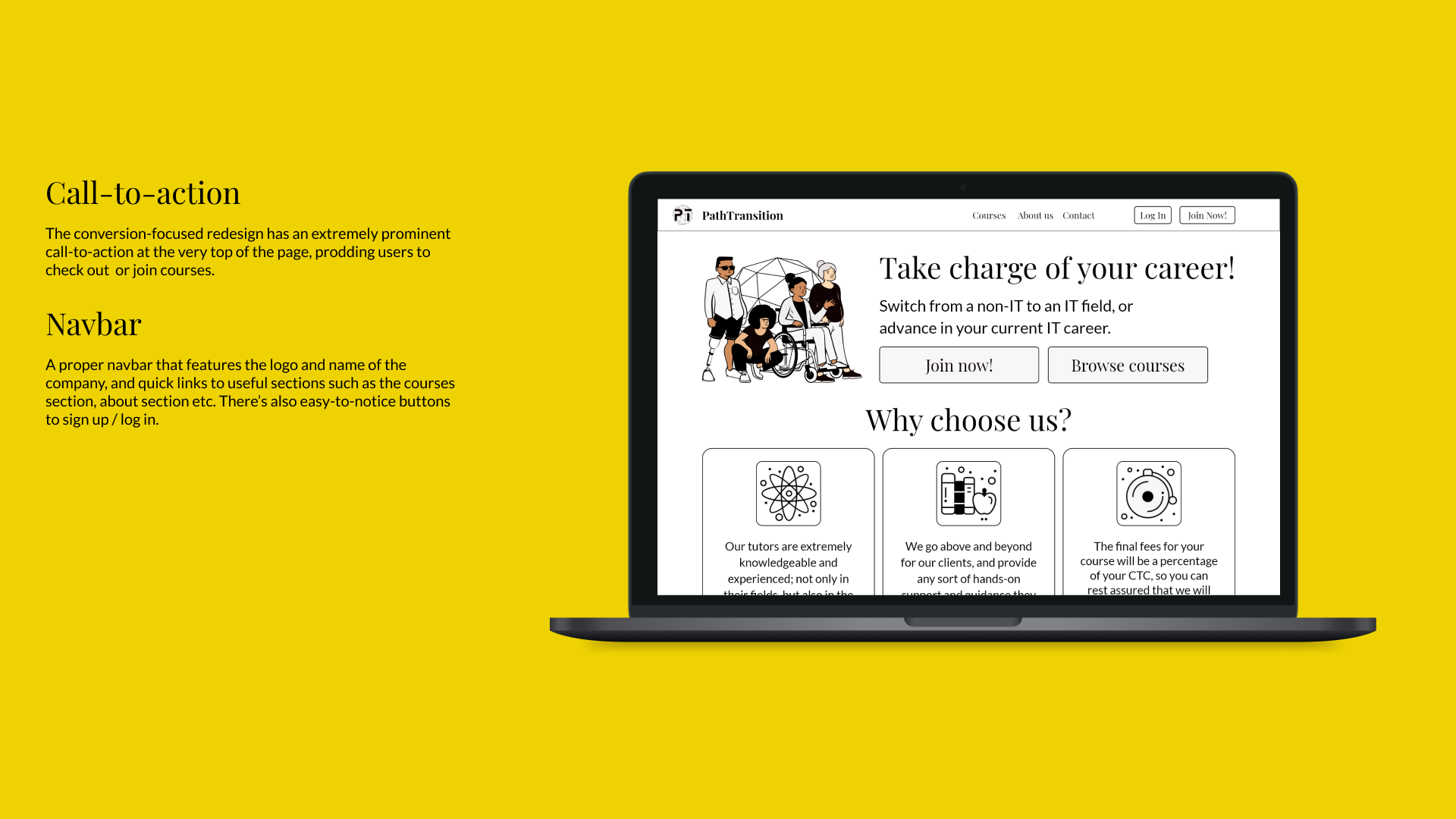
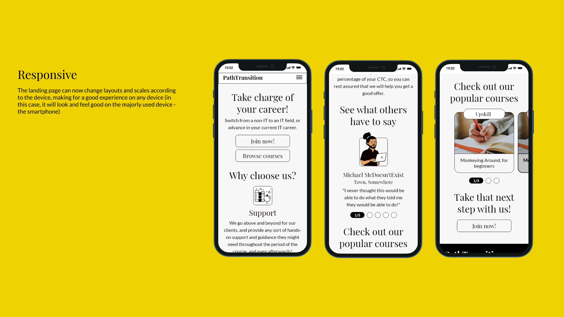
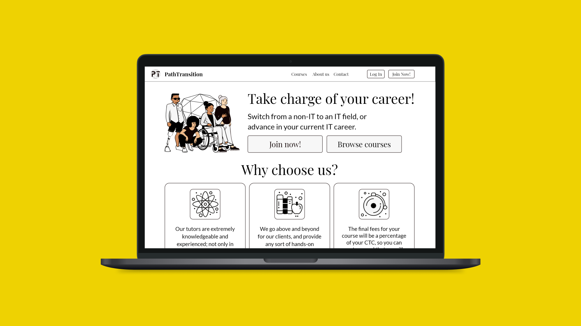
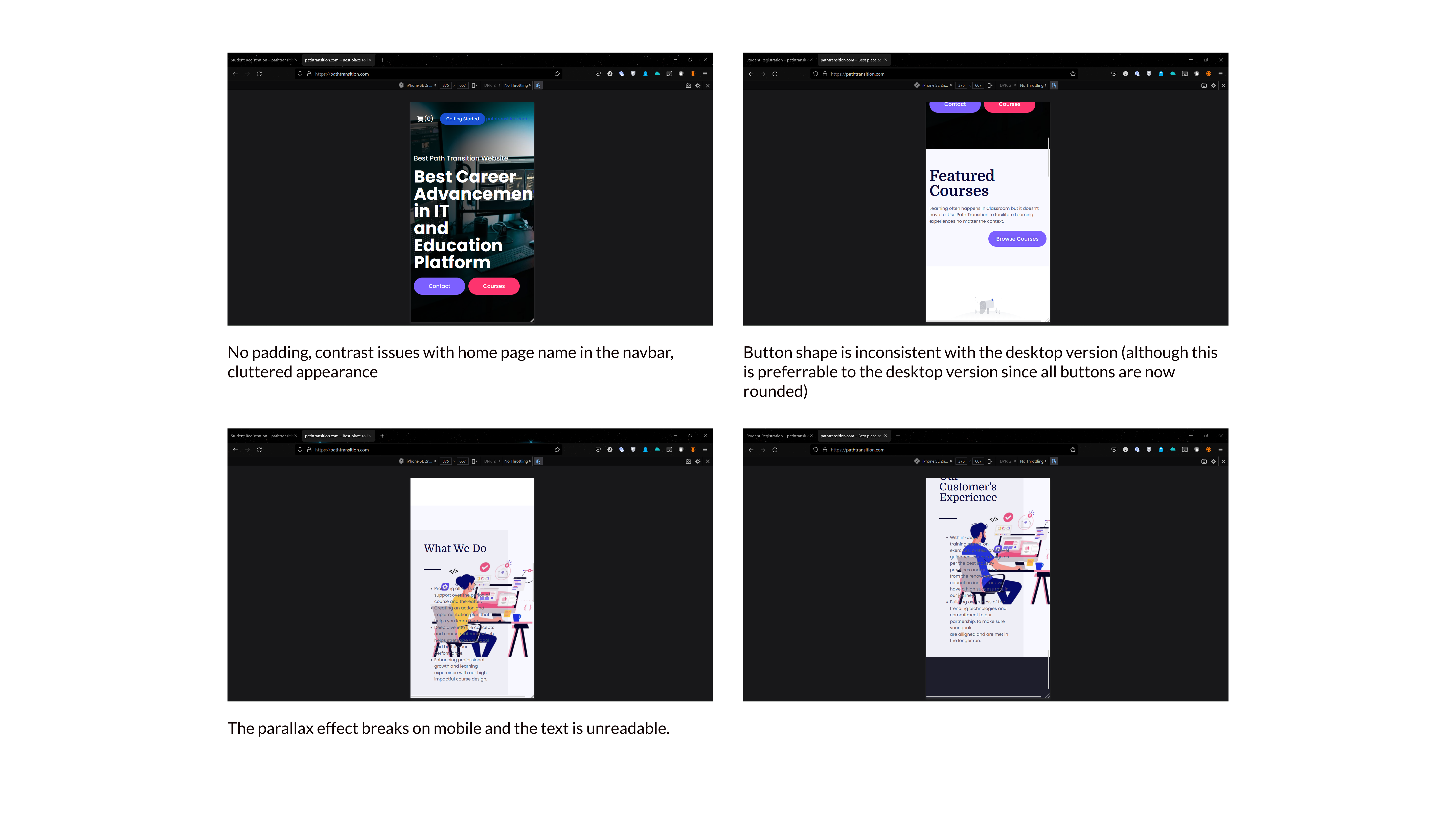
PathTransition wanted to overhaul their current website landing page to make it more attractive and efficient so as to increase conversions and traffic on the site. They also wanted the site to be responsive, as mobile users made up almost 70% of their annual traffic.
The Goal
To redesign the landing page for PathTransition and make it responsive, simplify the user journey map and build it with a conversion-focused design that is both efficient and aesthetic.
My Role and Responsibilities
UX Design, UI Design, Brand Identity
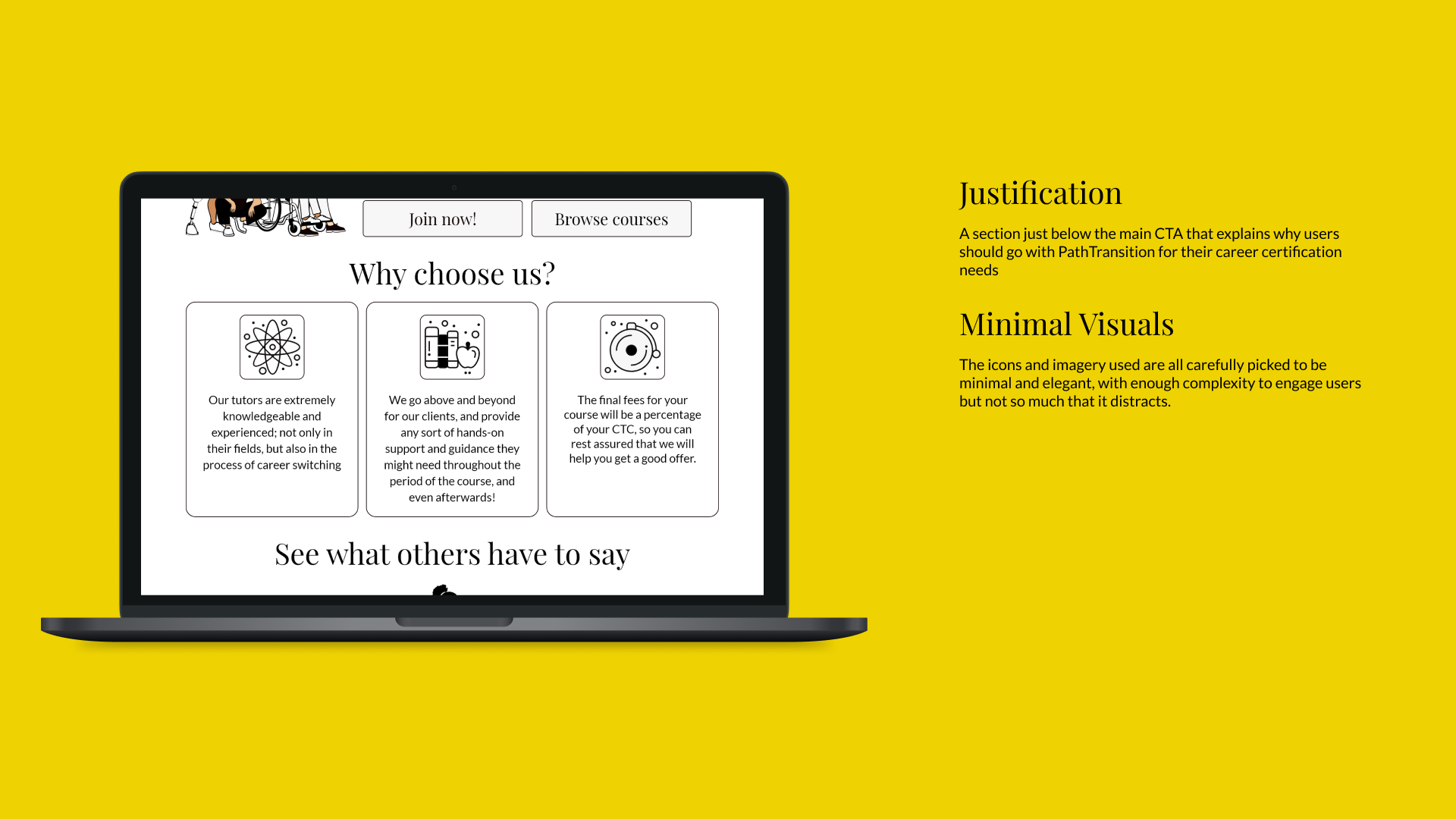
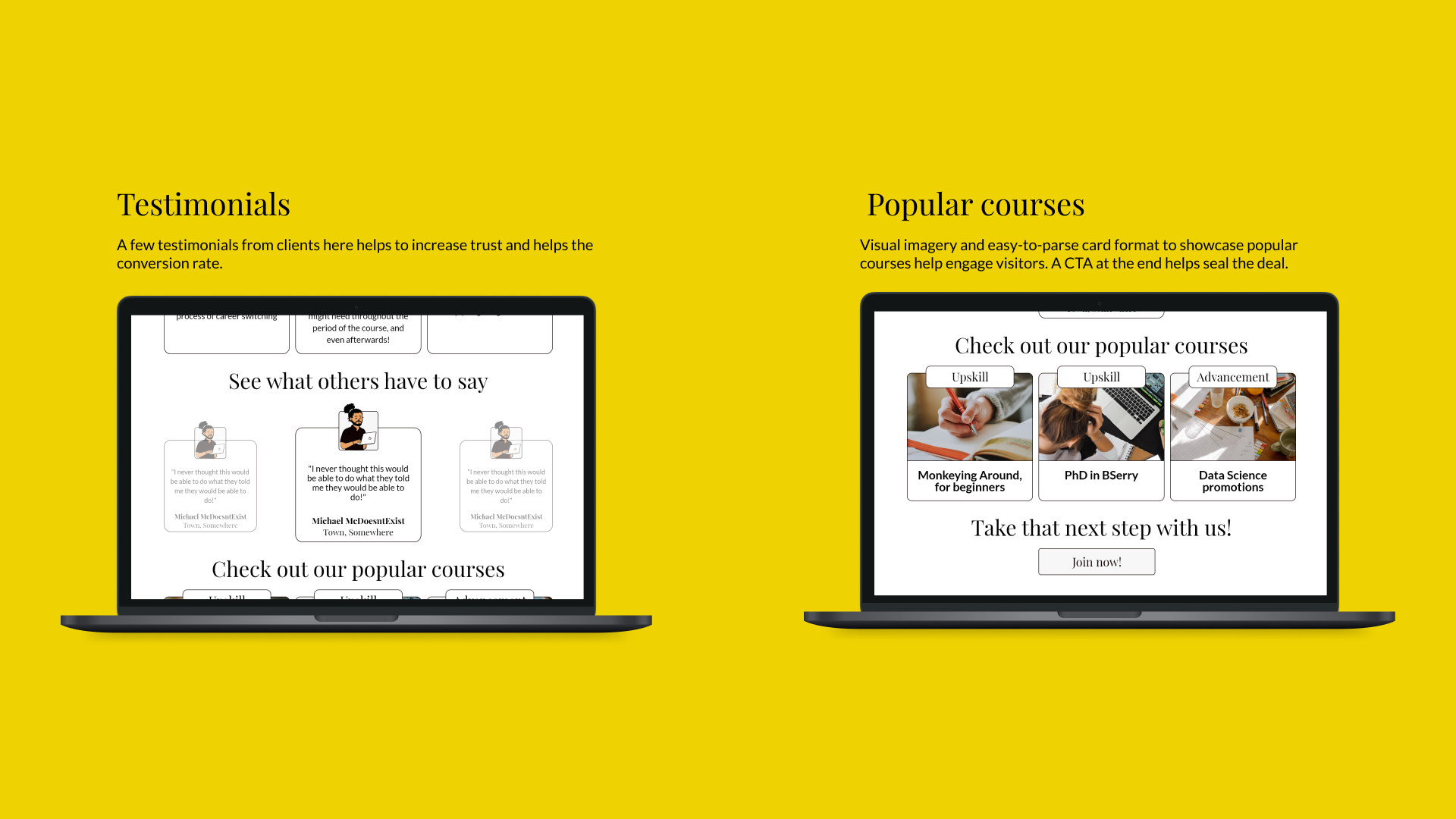
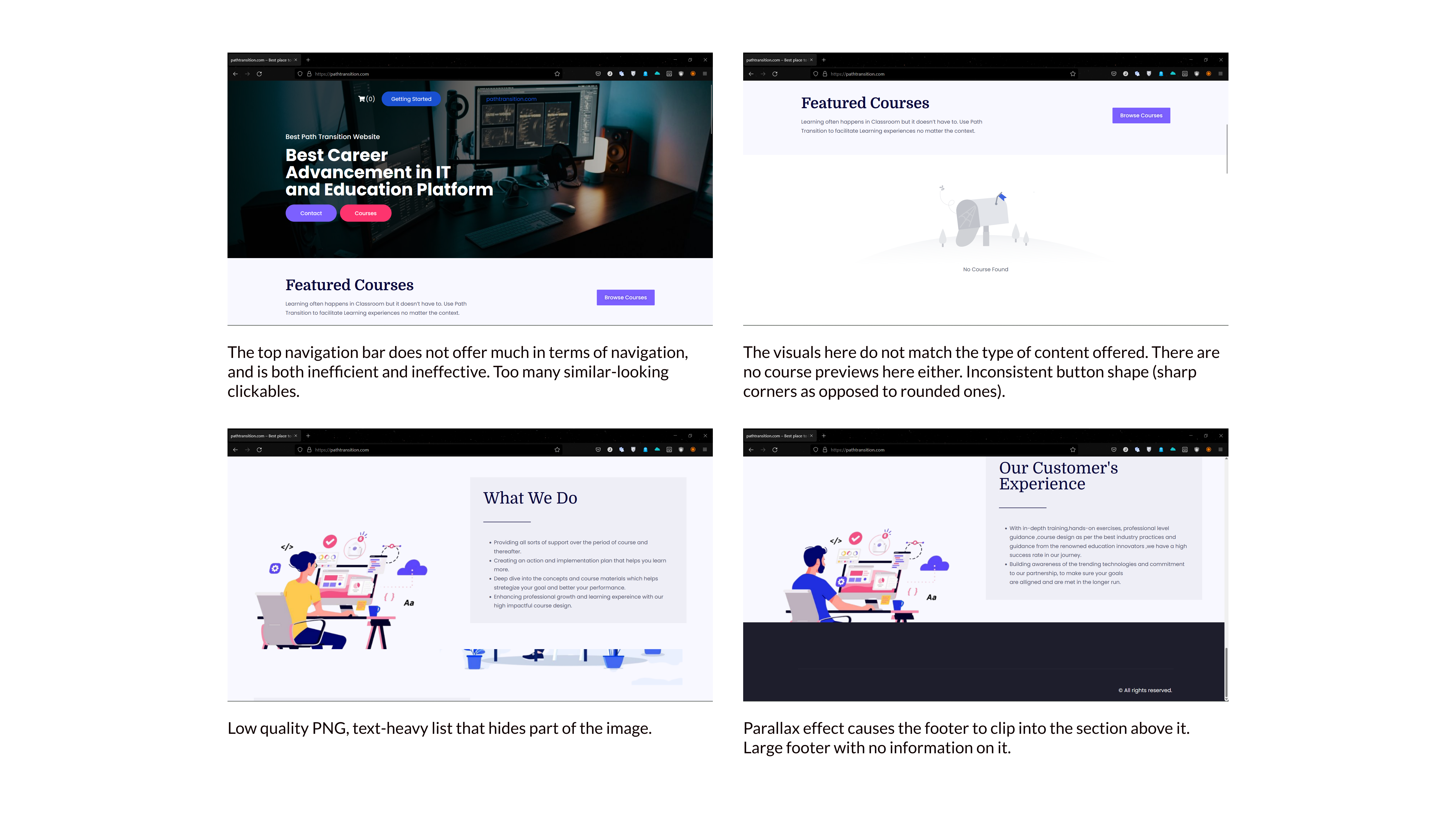
The content and format for the website already existed and the client asked me to follow the same as I went about making UX and UI focused changes to the site.
First, I took a look at the current state of the landing page and noted down the issues to address.
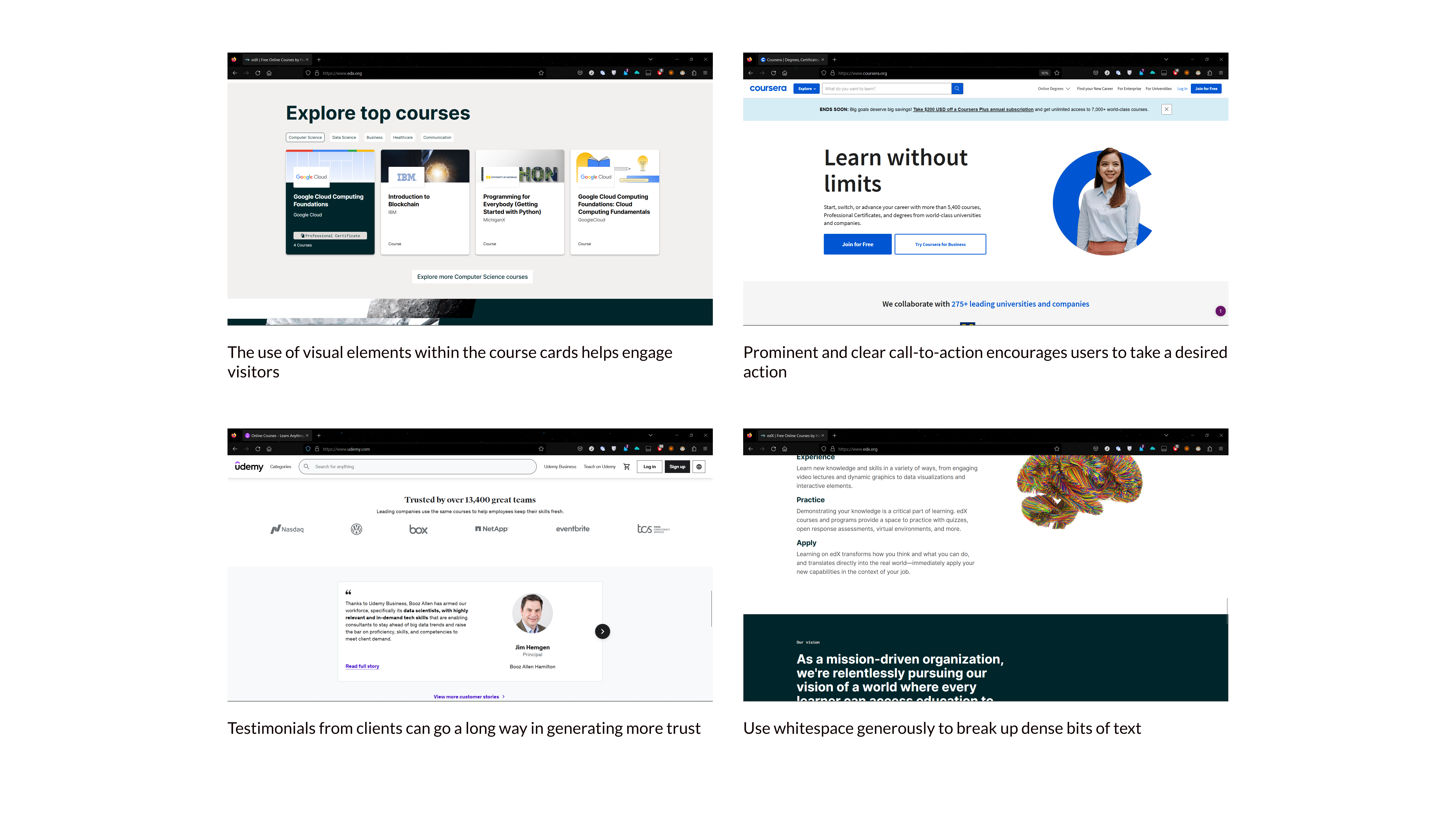
The best way to figure out how to stand out and to know what users might expect was to take a look at PathTransition's competitors: Other online certification companies.
With clear direction on the architecture and format, I attempted to design a unique, stylized experience for the client's site to stand out.
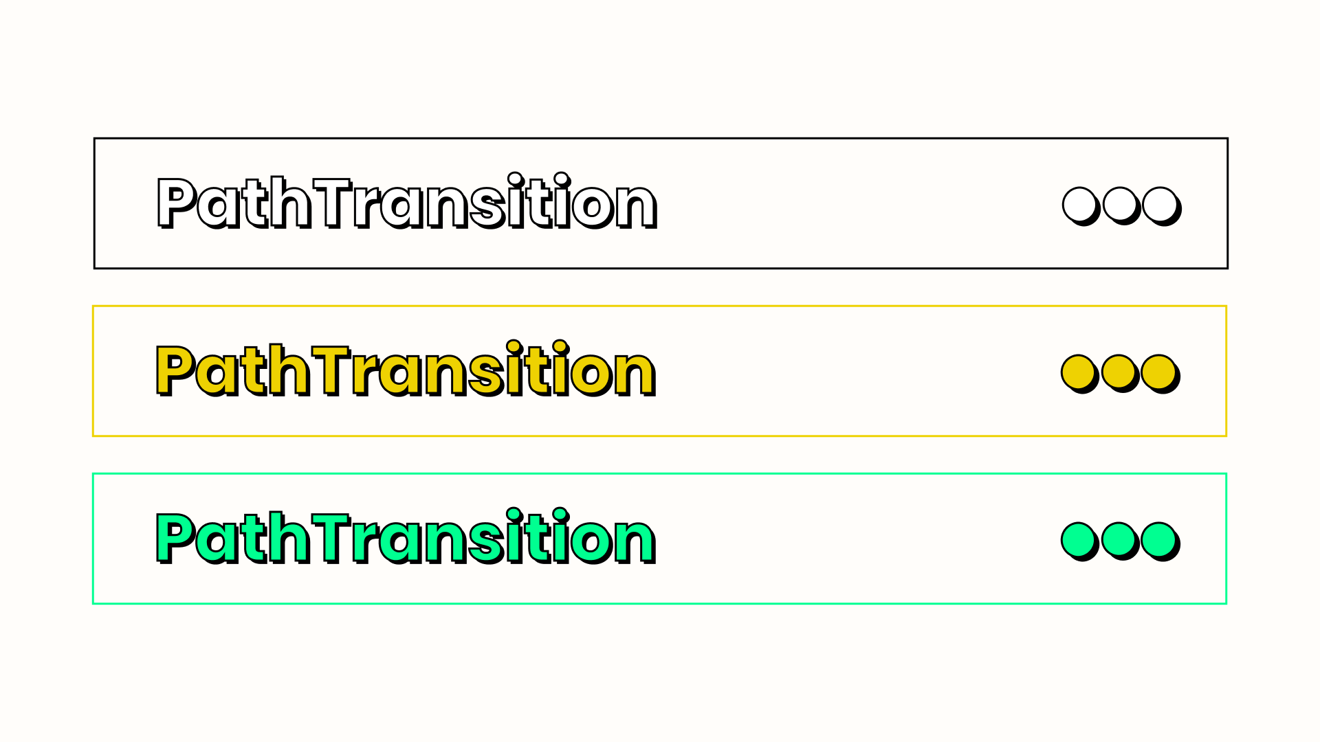
One of the most unique-looking design trends that was really catching on at the time was Neo-Brutalism, a style that was entirely comfortable in breaking many 'rules' of design with the usage of incredibly loud colors, large modern typography, 'uncomfortable' UI elements etc.
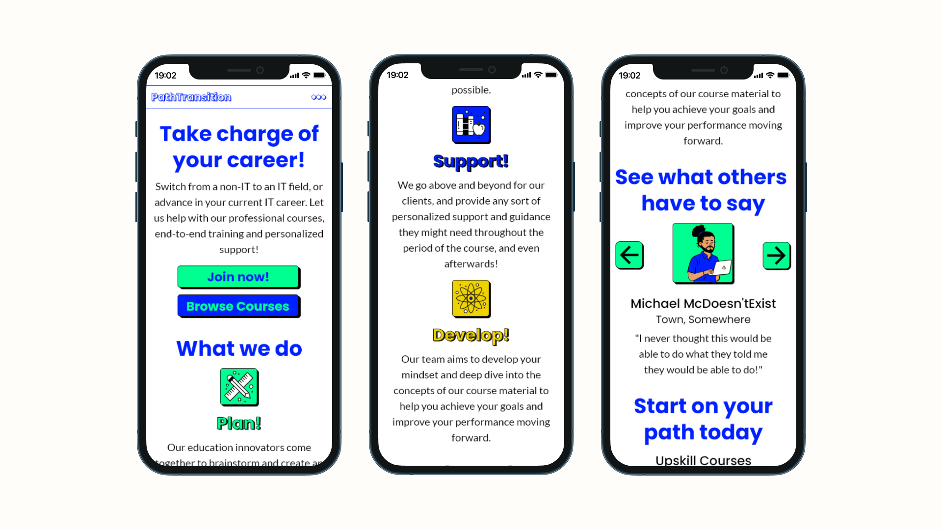
After reviewing the concepts, the client decided they did not want such an out-there theme to their site and asked for a more minimal and elegant style.
So, I switched to Serif fonts, traded out the bright colors for a simpler palette, and simplified the UI elements.
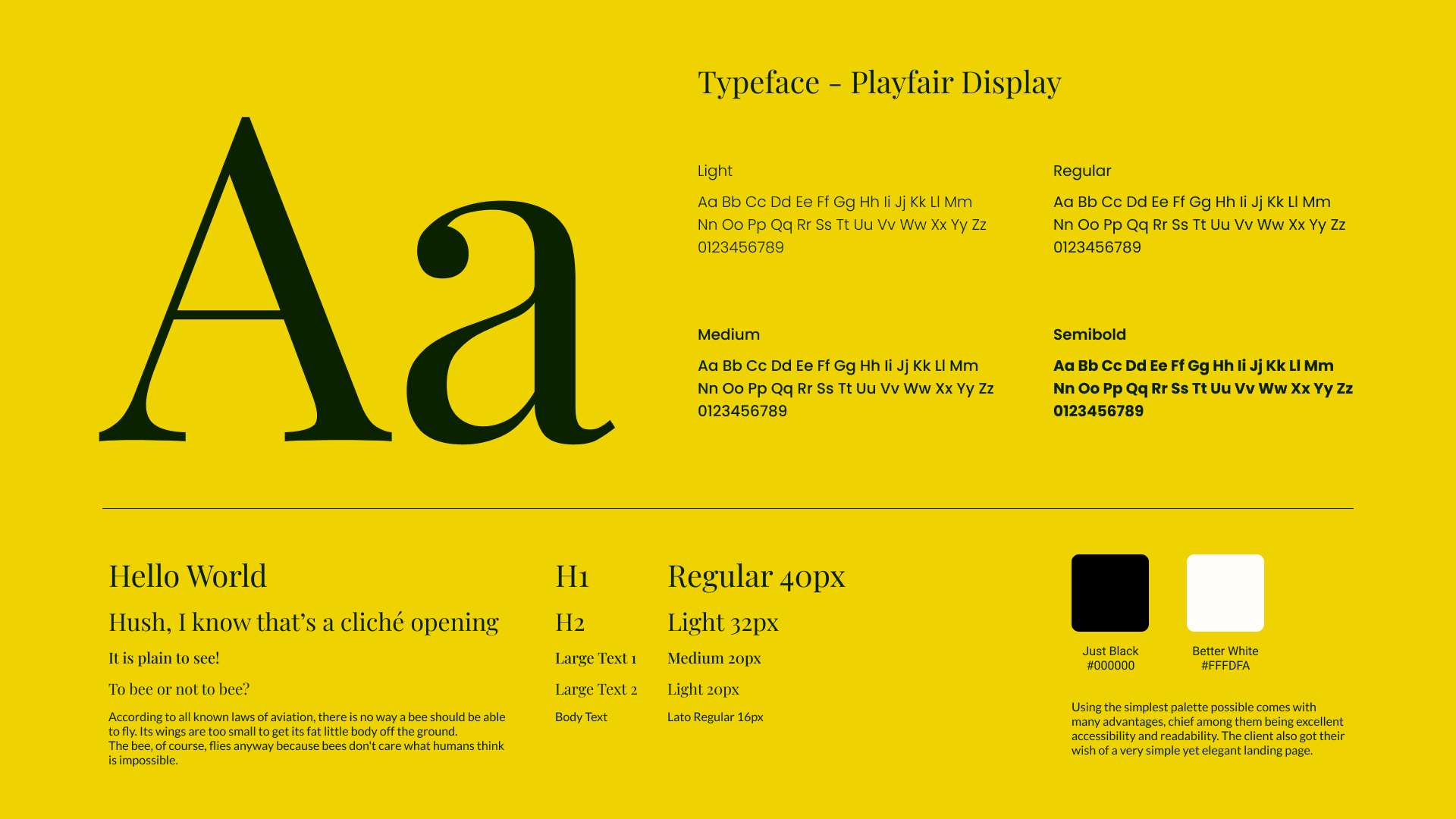
Utilizing conversion-focused design, the new landing page has a clear and cohesive message, a consistent theme that is efficient yet elegant and it is entirely responsive.